CONTACT
NEWS
-
COMMISSIONS Commissions for collectors continue to occur: For the Ayers Collection, "Embers", 30x34", acrylic on panel; ten small works on paper sold to the Hotel Figueroa, Los Angeles for their permanent collection. An acrylic work on paper commissioned for the MonteCedro Collection, called, "Many Mansions", 20x20"; and “Tender Mother”, 48x46”, acrylic on panel, for the Pietrangelo Collection were delivered. 
"Harvest", 44x43", acrylic on canvas. Collection of Charlene Davis, Los Angeles/Delaware. 
"Haiku”, 42x30" acrylic on canvas. Collection of Kristi & Brian Feutz, Anacortes, WA. 
-
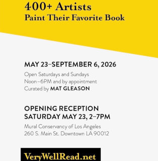
WE'RE VERY WELL READ May 23 - September 6, Mural Conservancy of Los Angeles, 260 S. Main St. Downtown L.A. 90012. Curator, Mat Gleason's epic painted book cover exhibition of 400+ L.A. artists.
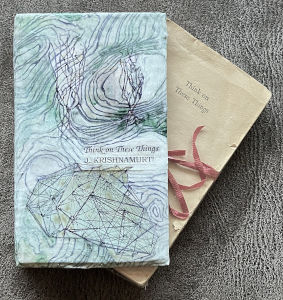
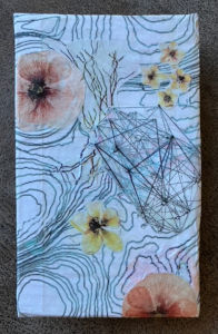
Barbara Kerwin's painted book cover for J. Krishnamurti's, "Think On These Things"; acrylic on 9x6" canvas.
https://verywellread.net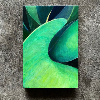
-
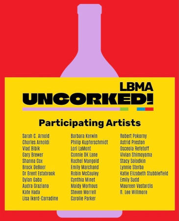
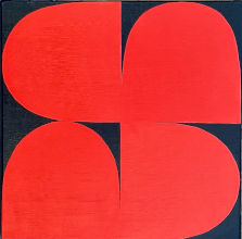
LONG BEACH MUSEUM OF ART, UNCORKED! June 13, 2026, Long Beach, CA. Featuring Barbara Kerwin's "FLEUR", acrylic on canvas, 12x12", 2025. Tickets and original painting purchases to support LBMA.org.
"Fleur", means flower in French. I have made many rectangular rotation compositions, over time. This past year I've worked with curves, and made "Fleur", as a prototype of a broader series, that employs a variety of colors. Since fleur means flower, it can be conceived as a single, joyful bloom when using abstract language.
-
EVENT HORIZON II February 6 - March 30, 2025, McNish Gallery, Oxnard College, 4000 S. Rose Ave, Oxnard, CA 93033. Curated by Mela M. With artists Dawn Arrowsmith, Joe Davidson, Veda B. Kaya, Mela M., Michael McCall, and Jill Sykes. 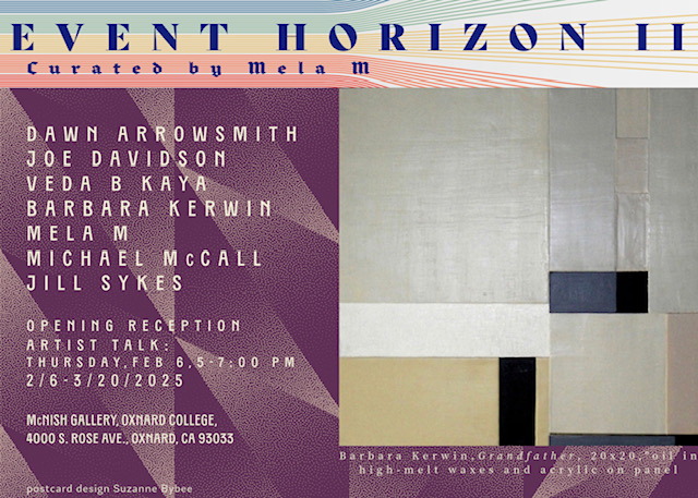
-
SPECIAL COLLECTIONS April 6 - 27, 2024, 515 Bendix Gallery, 1206 Maple Ave, Los Angeles, CA 90015. Curated by Danny Shain. 50 exhibiting artists were asked to make an original cover for their favorite book and display it in the exhibition. Barbara Kerwin's book is: "Think on These Things", by J Krishnamurti. Full catalogue on the 515 website:
https://www.515bendix.com
-
COUNTERPOISE October 16 - November 13, 2021, 515 Bendix Gallery, 1206 Maple Ave, Los Angeles, CA 90015. With artists Barbara Kerwin, Trang T. Lê, and Linda King.
https://www.515bendix.com
Press Release
-
JOURNEYS September 29 - October 10, 2021, Pop-up gallery space at The Invisible Dog Art Center, 51 Bergen St, Brooklyn, NY 11201. Painting: "THOUGHTS & PRAYERS", acrylic on canvas, 36x36" and accompanying written word essay: "Journeys" (How did you become an artist?) that were selected by Morgan Falconer, art critic and professor at Sotheby's for this see | me presentation.
https://www.instagram.com/p/CUIko-cLsRO/
-
PAINTING: 2011-2021 September 15 - October 13, 2021, An online exhibition at the Site:Brooklyn Gallery, including "Village for Vets" by Barbara Kerwin, acrylic on panel, 20x20". Juried by Peter Frank with essay: "Painting is Undead" by Peter Frank.
https://www.sitebrooklyn.com
-
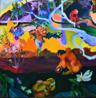
BONHAM’S AUCTION: HOME AND FINE ART January 26, 2021, "Strobe Light", 30x30, oil in high-melt waxes on panel, 1999. From the Paul Allen Collection. Exhibited 1999, Fractured and Factured, Los Angeles solo exhibition.
https://www.bonhams.com/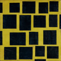
-
SCHACK AUCTION February 2021, to raise money for the arts in Washington State. "Barbara Kerwin Early Works":
"African Genesis (au P. Gauguin)", 30x30", oil on canvas, 1972 (left). Based on my HS Civics teacher, James Murray’s PhD dissertation, "African Genesis" fit into my love of Gauguin's colors, shapes and composition. Signed under my maiden name, Barbara Wallis.
"Altered Evolution", 48x48", acrylic and latex over mixed media on canvas, 1989 (right). 17 years later, a reinterpretation of the same theme: "African Genesis", now in a new language of abstract expressionism. Signed under my married name, Barbara Kerwin, Los Angeles.
Both works from the Laurel Anderson Collection.
https://www.schack.org/events/harts-benefit-auction-2021/
-
INTERSECTIONAL HISTORY February 13 - 23, 2020, Woman Made Gallery, 2150 S Canalport Ave, 4A-3, Chicago, IL 60608. With artists Barbara Kerwin, Hend al-Mansour, Tracy Barwick, Lamia Berrada, Theresa Brown, Marie Cameron, Niloufar Farzam, Mevi Juliet, Bonnie MacAllister, Helen Obermeyer Simmons, and Bonnie Smith. This exhibition, selected for the 2020 annual Women’s Caucus for the Arts, asked artists to analyze an individual through the lens of our society. My painting, "Thoughts and Prayers", (36x36", acrylic on canvas) references Senator Chris Murphy and his tireless work to bring about an end to Gun Violence in our country.
https://womanmade.org/wca-intersectional-history/ -
ZEITGEIST ARCHITECTONIA September 4 - October 16, 2019, Oxnard College’s McNish Gallery, 4000 South Rose Avenue, Oxnard, CA 93033. Curated by Mela M. with artists Barbara Kerwin, Dawn Arrowsmith, Rochelle Botello, Suzanne Bybee, Megan Geckler, Bonita Helmer, Lauren Kasmer, Mela M., Christine Morla and Asae Soya. From the imaginal Architectionia, artists bring their interpretations of the high vibrational frequencies that happen at the event horizon as a result of the gravitational forces that push and pull line, shape and color. The emerging feminine polarity in this age of SpaceX, like the structure of archetypes from the underworld, compel us to reflect on, redefine and even redirect our current linear perspectives. This exhibition brings together ten dynamic female artists who work in painting, sculpture, installation and video.
https://www.oxnardcollege.edu/news/zeitgeist-architectonia-at-the-event-horizon -
PERFECTLY IMPERFECT May 2018, Taj Gallery, Los Angeles, Curated by Jennifer Faist Hill, with artists Barbara Kerwin, Mike Vegas and Sandra Vista. A beautifully knit show by the curator and artists, who allow the hand to show in their elegant constructs. 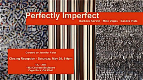
-
TRANSCENDENTAL MEDITATIONS October 2018, A two person show of Geometric Abstraction featuring Barbara Kerwin’s new asymmetrical geometry and the sculpturally geometric works by Eric Zammitt. The show opening is October 20, 2018 at the Project Room, INDEPENDENT PROJECTS in Bishop, California. The show runs through December 2018. In addition Kerwin will present a workshop on geometric reduction and color theory during the run of the exhibit. Curated by Karen Nielsen Licher and Bruce Licher.

-
NATIONAL NEWS 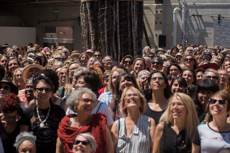
New York Times:
'Now Be Here' Takes a Portrait and Makes a Gender Statement
By Jori Finkle, August 29, 2016;
Barbara Kerwin, second row, center.
https://www.nytimes.com/2016/08/30/arts/design/now-be-here-takes-a-portrait-and-makes-a-statement.html -
ART STARS @ LANCASTER MUSEUM OF ART AND HISTORY Barbara Kerwin finds herself on the wall of ART STARS, Lancaster Museum of Art and History.
David Ruben Visual Arts Source:
Recently, a number of exhibitions around the country have stimulated my interest in group photography within contemporary art. In three of these exhibitions, artists and curators have arranged individual portraits in grid formations that bring to mind the many photographic matrices that fill the pages of Facebook and other social networking sites. In each project, the works combine to create a unique portrait of a community.
At the Lancaster Museum of Art and History (MOAH), Eric Minh Swenson exhibited over 200 photos of Los Angeles-based women in the arts. Produced in collaboration with Coagula Art Journal, the exhibition was titled "Art Stars," a moniker that reflects L.A.'s cultural preoccupation with celebrity. Installed in the MOAH galleries from floor to ceiling like wallpaper, the images were of female artists, curators, writers, gallerists and collectors, all of whom have contributed to the diversity of the L.A. art scene. In lieu of traditional labels, short text about a subject's cultural role, written by Coagula editor Mat Gleason, was printed over each photo. Additionally, stacks of takeaway copies of a special Coagula edition featuring over 150 of the images were situated on the floor adjacent to the installation.
During the course of his work as an accomplished filmmaker, Swenson has been methodically documenting the L.A. art scene, and thus he approaches his tasks much like a photojournalist. Rather than being staged, his photos are taken during the normal course of a subject's activities, such as working in the studio, hosting an event, or mingling at a reception. Whether looking at the photos in situ or in the zine, there is vastly more information that one can absorb in a single viewing, which is why the Coagula version is of particular value. Overall, the images in Swenson's collection are quite varied, with the most compelling examples being those where he has zoomed in to capture a subject's facial expression, wherein one can observe signs of strength, confidence, and endurance — testaments to the fact that, as women, many of these individuals have overcome considerable obstacles to achieve their successes in an art world that has been traditionally dominated by men.
ART STARS by Eric Minh Swenson, commemorative Coagula Art Journal, 2016 edition, Mat Gleason wrote of Barbara Kerwin’s work:In her elegant [oil in high-melt wax] constructs, Barbara Kerwin paints a structured perfection that can only exist in art. The abstract is too often diminished as a place where the impossible goes to wallow, not so in the triumphant, ethereal geometry of one of her layered painted compositions.
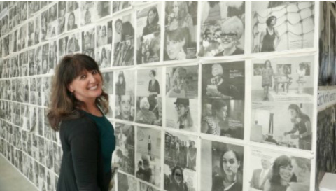
Photo by EMS -
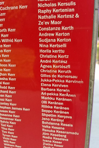
ARTISTS MONUMENT INSTALLED at the University of Illinois, Chicago, August 11, 2017. Artist Tony Tasset, etched the names of 400,000 artists into the brightly colored plexiglass installed on shipping containers. His sculpture measures 80x8x8 feet. ARTISTS MONUMENT was first exhibited at the 2014 Whitney Biennial. See Barbara Kerwin’s etched name, under “K”.
https://www.youtube.com/watch?v=Q816y9afmOQ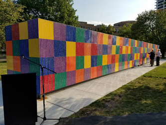
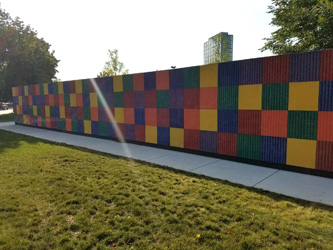
Photos courtesy: Dwayne Johnson Cockran -
DRAWING FROM THE INSIDE OUT, author, Barbara Kerwin Barbara’s, Drawing from the Inside Out, is now available on AMAZON in paperback or kindle.
It is a 216 page full color, three-course in one, college-level, drawing textbook, beautifully designed by Jon Measures. The book is presented at the College Art Association conference each February. In 2018, the conference was held in Los Angeles, where Barbara Kerwin presented a lecture on Simultaneous Contrast in Color Theory since the Bauhaus.
Drawing from the Inside Out is available on Amazon: $89/paperback & $69/Kindle.
https://www.amazon.com/Drawing-Inside-Out-Projects-Beginning/dp/0996272704
See the first 30 pages of the textbook and purchase.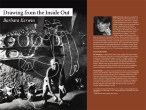
-
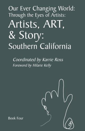
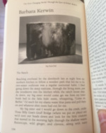
OUR EVER CHANGING WORLD: THROUGH THE EYES OF ARTISTS (BOOK FOUR) Artists, ART, & Story: Southern California, by Karrie Ross: 90 artists tell a story about a remembrance, not about art. My story is called, "The Ranch", (Barbara Kerwin). In this short story I share my remembrance of growing up off the grid on a 160-acre ranch in the Olympic Rain Forest in Washington state. We had kerosene lamps and outhouses and tons of animals, surrounded by moody, mountain beauty.
https://www.amazon.com/Our-Ever-Changing-World-Through/dp/1532845243
-
OUR EVER CHANGING WORLD: THROUGH THE EYES OF ARTISTS (BOOK SEVEN) Artists, ART, & Story: A Moment in Time, 2017, United States, by Karrie Ross: Artists tell a story about a moment that had an impact. My story is called, "The Women’s March 2017" (Barbara Kerwin), and is the first story in this edition.
https://www.amazon.com/gp/product/1986004228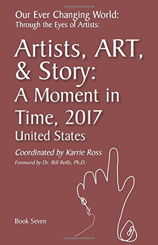
-
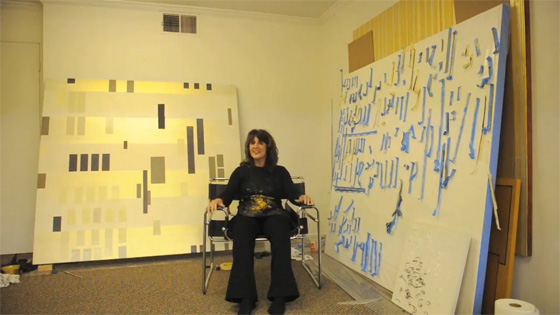
Barbara Kerwin Video Interview, Aaron Fooshée